A one-minute look at work in motion.
Welcome to our new regular series: A Clockwork Minute. In this series, we’ll be sharing snapshots of work in progress and how we’re solving problems real-time for our clients.
We’re redesigning the website of a large Midwest county government, bringing County, Parks, and Library together under one roof. Each has its own brand identity, web strategy, and story. They share an audience but struggle to engage that audience across brands. For nearly a decade, they’ve shared an aging SharePoint site that’s done more to limit communication with residents than support it.
Our team is approaching the work from strategy through design and change enablement.
The opportunity is to build something flexible, a system that holds three distinct brands without flattening them into one. That’s the tension at the heart of this work: creating cohesion without compromise.
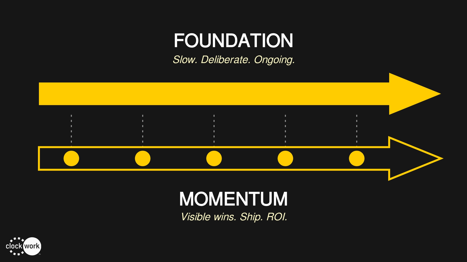
The design challenge
Right now, we’re focused on navigation and hierarchy. We’re designing a universal navigation pattern that dynamically adjusts to each brand identity while maintaining one consistent and predictable navigation pattern between them.
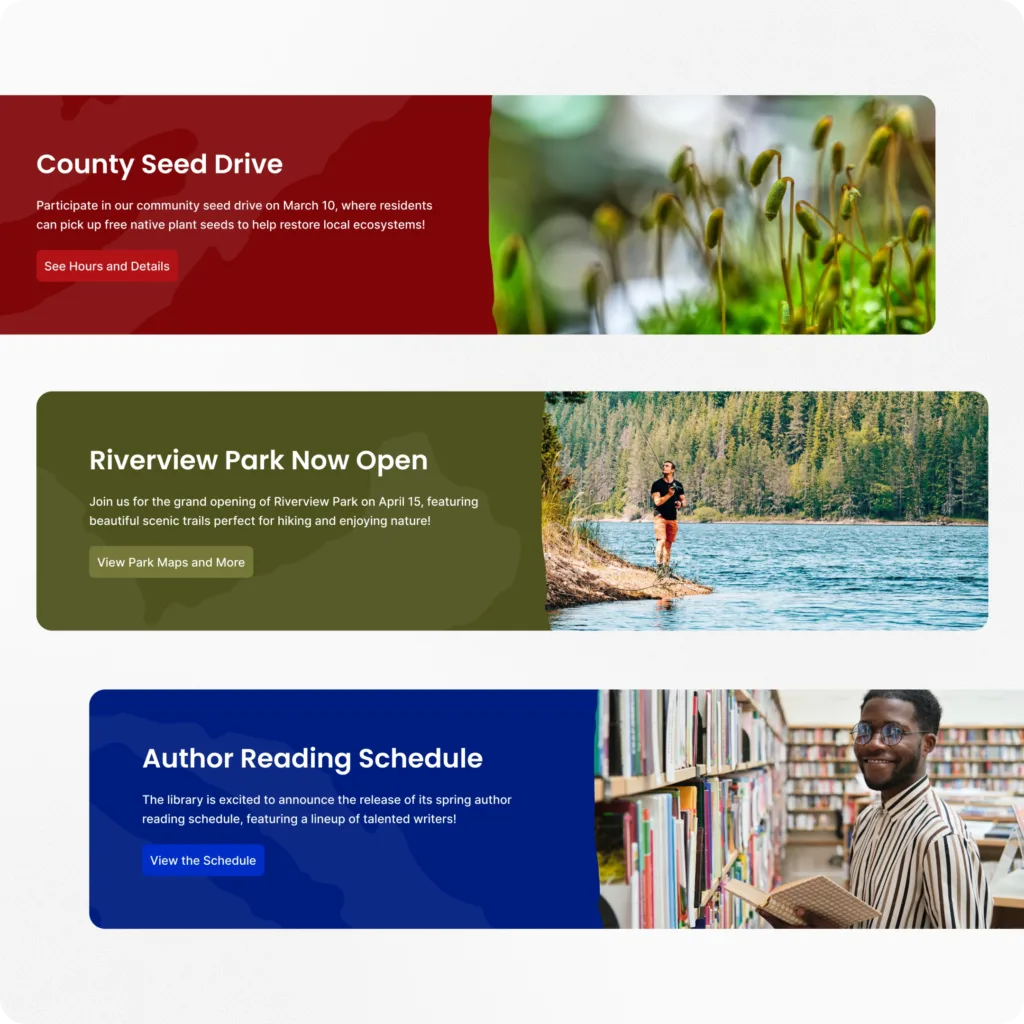
Think about how Gap and Old Navy coexist online. Distinct brand stories, but with the benefit of a shared design language to bridge audiences between them. That’s the goal.
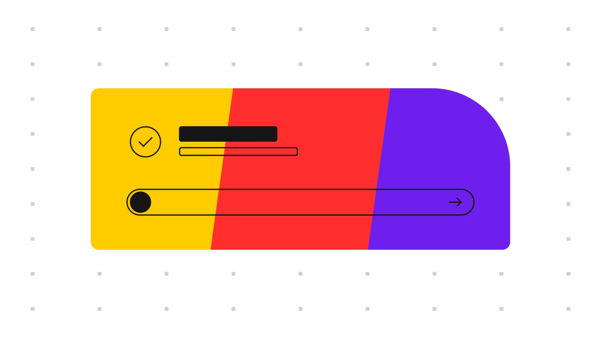
It’s not just a branding problem. It’s about accessibility and clarity. Today, the search input changes. The navigation moves. People have to guess which brand they’re interacting with. The redesign solves for that. The information hierarchy will stay consistent while color and brand graphics are seamlessly interchanged. Every page clearly signals where you are and what you can do next.
That’s what cohesion looks like in practice: not rigid sameness, but controlled flexibility.
What we’re learning
This work reminds us that design systems are communication systems. They’re not just collections of buttons and components; they’re frameworks for how people tell stories together.
Inside the county, each department has learned to work around its tools, asking, “What can I wedge into this template?”
Our job is to shift that question to, “What does my audience need?”
That shift takes more than design. It takes trust, flexibility, and support, so our designers are working closely with our change enablement team. Because in the end, systems don’t just shape websites; they shape how people work together.
What’s next
We’re in Sprint 2 of 4. Navigation patterns are taking shape. Search behavior is being mapped to real data. We’re creating components that enable authors to tell stories that will resonate with residents.
Next up: refining the visual system to bring each brand’s personality forward while keeping everything aligned and accessible.
We’re reducing complexity to communicate better. That’s what good design does.