Learners Edge has a very motivated user base: they offer continuing education courses to K-12 teachers who need the courses, and graduate credits, for salary advancement and license renewal. Their typical site visitor both wants and needs what they’re selling, yet the site design wasn’t supporting that laser-focused user.
The challenges our client faced
Like many businesses, the Learners Edge website grew organically as their business expanded. The content, architecture, and design incrementally evolved, but not always with a long-term vision in mind. We all know the situation (and yes, even as a digital agency we are guilty of it): You add a page, or a link in the utility navigation because it needs to be added now. Then it happens again, and over time, you have pages and links that don’t necessarily ladder up to a strategic objective or a clear user experience.
Overall, Learners Edge wanted to improve their user’s experience. There was friction between what users wanted to do, and how easy it was to do it. Some specific challenges included:
- They had awesome content that was hard to find because it was pushed too low on a page to be seen easily, or on pages, people weren’t even getting to.
- Their competitive pricing wasn’t clear, so customers didn’t always know there was an advantage to purchasing classes through Learners Edge (versus a competitor).
- Each course purchase took many clicks to complete, which lead to cart abandonment and likely fewer transactions.
- The path to the course catalog required too many clicks.
The Hubspot-platformed website needed a refresh to align with the core user and business goals: accurate and easy class purchases.
What Clockwork did to help
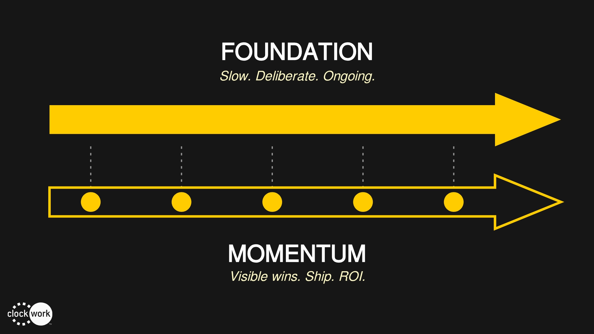
The most significant thing we did was simplify the user’s path to value. Working closely with the Learners Edge team to ask “why” and “for who” to streamline content and architecture. The answers to these questions provided the broad strategy that we implemented across the site: user-centered e-commerce.
Reduced distance between starting point and user goal
In an effort to get people from start to “that’s what I need!” faster, we went from 3 clicks to 1 to get them to the page with course listings. With this change, we decreased the homepage bounce rate by 7% and increased course listing page views by 24%.
Clarified on-page content hierarchy
Knowing you’re in the right place throughout a website experience often comes down to content: clear language with good formatting. Now, when users land on a page, the headline tell them where they are, and the content they are expecting is front and center.
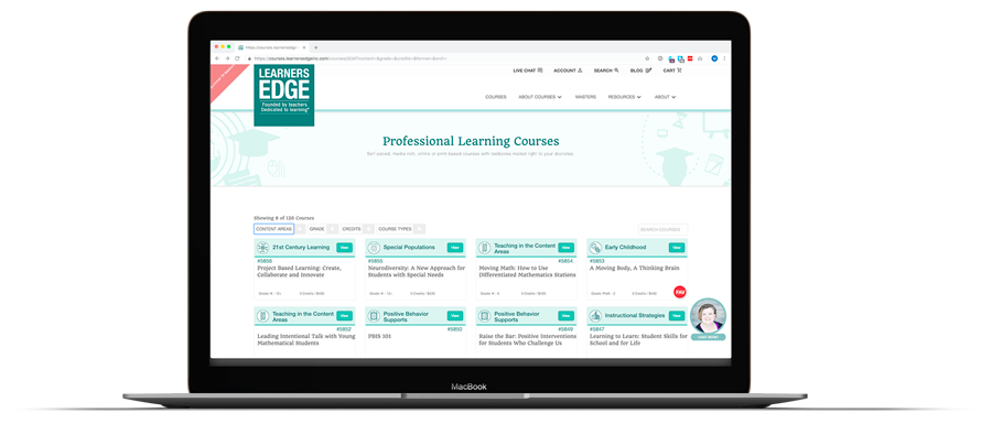
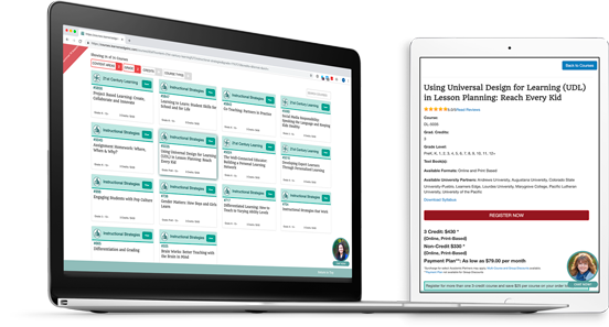
Redesigned search and filter options
Browsing isn’t a huge part of their customer journey because their customers know exactly what they want. So we gave them the tools to find it quickly and easily. We implemented faceted search, aligned filter options with professional requirements and audience segments (grade level, for example), and now display search and filter results more clearly.
Elevated the most important information
We added pricing to the “all courses” view, reducing the need for the customer to click into a course to see pricing and the number of credits granted. We also leveraged a set of iconography that Learners Edge had to visually communicate course themes and topics. This all gives each customer a snapshot of critical information at a glance.
Delivered value to the client faster
Working in an agile way, we completed the redesign in two months. Knowing fall was a critical business cycle for them, we partnered to prioritize and optimize features without getting distracted by all the options.
In total, we reworked the UX, completed a thorough content review and reorganization, freshened the design, and engineered the solutions that were hosted on Hubspot.
“Clockwork helped us clarify and optimize in a really user-centered way. I appreciated the way they focused on making changes that always tied back to the results we were looking for, and collaborated with us to make sure we were aligned along the way. We’re happy with the outcomes, and the results speak for themselves!”
The impact we made on their business
When we asked the client how she knew we were successful, her first comment focused on the 29% decrease in on-site chat volume. The chat was there to close sales, but the staff ended up training visitors on how to navigate the site. This decrease significantly frees up their staff to focus on the work they’re hired to do and illustrates that the changes were effective in getting visitors to the information they need.
Next, our client said, “The site is so much easier to use now, that was a real game changer.” In short, we made the site work harder for them by making it easier for their customers. From both a quantitative and qualitative perspective, this is a huge result for them. They know their digital property is easier to use and their products are easier to purchase, and that feeds up into a customer experience that is more positive.
And now, for the numbers.
Revenue increased by 42.67%
Conversion Rate increased by 5.21%
Number of transactions increased by 49.43%
Number of sessions with transactions increased by 53%
Pages per session decreased by 36%
Decreased overall bounce rate by 8%
29% decrease in chat volume
Reduced path to products from 3 clicks to 1 click
(All data are taken from the same times period in 2017 and 2018 for comparison.)
While revenue is the gold standard metric, several of the metrics above also point to better customer experiences. We saw a spike in both the number of transactions and the number of sessions with transactions. This shows more of their customers are purchasing once they are on the website.
Additionally, the pages per session decrease combined with a rise in transactions shows that people are getting to the products they want to purchase quicker and are purchasing more. Fewer people are leaving (bouncing from) the site and fewer visitors are asking the chat sales team navigational questions.
By making purposeful and targeted website enhancements, we were able to make a significant impact on Learners Edge’s bottom line. The best part is that the data points to long-term success, too. Here’s to more incremental growth and many more happy learners.